Wednesday 28 April 2010

Font/Title


When choosing my logo I referred to some others for inspiration, Firstly i looked at the logo for POP magazine, the logo changes texture with every issue to blend into its surroundings possibly connoting that pop is a culture and this magazine is submerge in it. Secondly I looked at the logo for i-D magazine, it is super playful as it is always presented on it side to make a winking smiley face. Due to this they always have the cover-star winking too. Both of thse logos were playful and relevant to the theme and content of their magazines, after looking at these i came up with this for my magazine logo:

I chose the title BILLIONAIRE for my magazine because my magazine is supposed to be about the 'money, success, fame, glamour' lifestyle and I think Billionaire would be an exaggerative way to describe this club-kid lifestyle. Ii thought the diamond like font (entitled Diamond-D, found on dafont.com) is also very reflective of this. I think the font is slightly ambiguous to read which could connote that only people with an eye for diamonds and luxury would understand such a font.

I think I will keep the font in black as it will stand out nicely on the white wall background of my photos and will also contrast to the brightly coloured cover girl.

Tuesday 23 February 2010

final magazine evaluation


The above are images of my final double page spread, content and front cover.

When looking at my magazine it is apparent that I drew inspiration from magazines like supersuper and nme but didn't emulate them. I created a look which has an individual appeal I think it has the same effect as any magazine of a similar calibre. I strayed from the traditions of having writing all over the front cover to make it appear more artistic and focused on the main artist, I did make a feature of the magazine title , almost branding said artist as a part of the cover-star family of Billionaire magazine. I used a female on the cover of my magazine although the character i created was styled and based on a cross dresser which would highlight the gender ambiguity of my chosen genre. I think not only will this appeal to other women but also men and transvestites who see a strong female figure prominent on the cover of a music magazine. I used an unusual font for my title because i felt it was highly relevant to my genre (see post entitled Font/Title). Over all I wanted to create a magazine that would get former clubkids and enthusiasts of this movement excited, this is why I decided to make this issue THE CLUBKID ISSUE. My magazine is an Electro-Clash specialist magazine and so it has decided to create an issue to celebrate the 'hey-day' of the genre.

I don't think there is a specific social group that my magazine targets as all different sorts of people involve themselves in the electro-clash genre. The use of colour will attract these sorts of people, but I think as the style of such artists is so varied it would more realistically be the persons face that would lure them in, which is why I made the artists face my main factor on the front cover. I wanted to attract young people as well as older people who would have actually been club kids, which is why i paid homage to them in this issue. As my artist is someone who was and still is representing this movement of people it will lure in people who also still celebrate the early 90's.

In a previous blog entry I highlighted who I think my audience would be before and I think it still stays true to that after having finished my magazine.(http://mediacourseworkmaintaskchaniralayzell.blogspot.com/2009/10/target-audience.html) The only difference in opinion now is that I think there may be a select amount of older people (40+) who may have been around or even involved in the club kid movement and would buy this specific issue of BILLIONAIRE to reminisce.

I think I attracted my target audience also, by having a believable and proffessional looking layout. Writing voice is also important (referring to article) as it would have to be written using terms that the target audience will understand and maybe even use themselves to make it more relatable.

From the production of this magazine I have had the chance to experiment with InDesign and Photoshop, learning most from InDesign as (unlike Photoshop) this programme was brand new to my mind and so getting my had around it was a learning curve. My progress is visible when comparing this magazine to my preliminary task. The preliminary is definitely more basic and is lke this due to my basic understanding ofInDesign at the time whereas I like to think my main task magazine is much more believable and advanced looking as i have learnt and understood new techniques in the aforementioned programmes.

Tuesday 26 January 2010

Photos


(FIRST TWO IMAGES : INSPIRATION. SECOND TWO IMAGES: OWN PHOTOS)

I wanted the images on my front cover to correspond with those on my double page spread as I found that most music magazines have their main featured artist doubling as the cover star. I drew inspiration for my models make-up from a cross dressing pop star named Jeffree Star. I made sure to use really bold, acidic colours reminiscent of colours that the original club kids used to be seen in.
I edited them in photoshop (as seen on the bottom picture) to make the colours much more vibrant and to make the makeup look super smooth. I let her wear her own clothes as I thought the contrast to the hair and makeup actually worked and also made her facial aesthetic more shocking and loud. For poses I wanted her to appear almost unapproachable with an heir of a superior attitude.


Tuesday 3 November 2009

Flat plans


I used SuperSuper magazine as a reference for my flatplans as they are a music/fashion magazine that cover a lot of the same musicians my music would cover. I took a lot of influence fromt he way in which they do not stick to the traditional layout of a magazine. I plan to take this kind of haphazard approach with my magazine but I will be making it slightly more structured by sticking it to a theme of Clubkids who were a movement in New York in the late 80's/early 90's who pioneered the electro clash sound.
FRONT COVER PLAN

I want my front cover image to fill the whole page (as with many magazines). I want the image to be cropped into an extreme close up or to just be an extreme close up of the 'artist' who I will also feature in my interview. Instead of having writing all over my front cover I only want the title. At this stage I have not chosen a title. I want the colours of my front cover to be very bright and acidic: this will draw peoples eyes to it on a shelf and would also appeal to people who follow the scene my magazine refers to.

CONTENTS


I'm not too keen on the traditional list style of contents page, so I tried to develop a different way which would still be easy to use. I have decided to place photos of the inside features on a grid and edit on page numbers over the image in a sort of advent calendar like fashion. I will display the images in numerical order to stop it from being confusing.


DOUBLE PAGE SPREAD
I want to use lots of imagery in my double page spread because I want to use as much of the photo shoot as I can to reiterate the idea of the glamour and fame of being a clubkid/musician. Also for this reason I want the heading (artist name) to be in huge letters. To keep a running theme the font used for the heading will also appear in the questions as a way to highlight the difference between Q + A .

Tuesday 20 October 2009

Analysis of existing magazines


I was unable to hunt down any covers of magazines from my chosen genre, however I managed to attain some which either focus on a number of genres, including electro, or magazines that have the same or are influences of electro.

NME


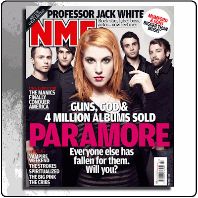
The first thing I noticed about NME is that the band name is larger than the magazine title: This insinuates two things: Firstly it insinuates that the main priority of this publication is to support bands instead of get their own fame and secondly that the magazine is already well known enough that the title doesn't need to be the main focus because people will recognise which magazine it is instantly.

The whole cover has a colour scheme of red, black and white which has rock connotations. These are the only colours on the cover which makes it look neater.

They have got the front-woman of the band to stand much further forward then her band mates which gives the reader and easier way of quickly identifying the band as opposed to forcing them to note all five faces. Glorifying the vocalist of a band in photos is a common recognition tactic.

Every feature displayed on the front cover includes a band name showing that they do not cover ANYTHING that isn't music related.

Rolling Stone


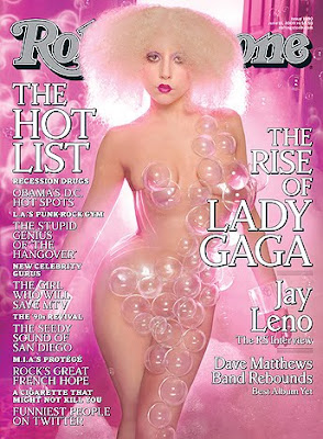
Rolling Stone magazine are also a well recognised music magazine, so they have also let the cover star overshadow the brand name, this time by putting her head in front of it.

The colour scheme is pink and white, but pink is definitley the more predominant colour. The combination of all of the pink with the bubbles and the fact that the cover star is Lady Gaga screams Pop. Bubbles are often linked to Pop (because they pop) and so this is very relevant to the music of Gaga. I wouldn't want to use bubbles to signify the genre of my own magazine because, unless done extremely well (in this case shot by David LaChappelle) it can look really tacky.

Regarding the features of the cover there appears to be correlation between the size of the words and the importance of the story (the larger the writing the more important the story)


NME CONTENTS


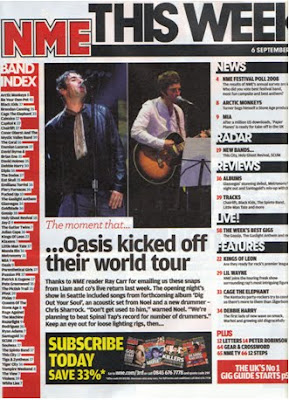
The focal point of this contents page is 'The moment that Oasis kicked off their world tour'. Having a story in the contents makes it seem like the magazine is overflowing with news because theres multiple information in every single page (other than ad's obviously).


The colour ccheme of the contents is based around the colours of the logo (red/white)/black). However, they have added in flashes of yellow to draw the readers attention to other points of intrest, in this case the yellow is used to draw the reader to the subscription offer.


As well as having listings of news/radar/reviews/live/features there is also a band index which also shows how many different bands they cover in this one issue, again making it seem like they include more than they actually do. This is a way of making the reader feel as if theyre getting their money's worth.


The magazine name, band index, news etc and subscription section all frame the Oasis story which is another way of making people read it before they go off finding other things in the magazine. It is as if the editors have already decided the best way to make sure the reader takes in as much information as possible and almost pre-programmed their route through the magazine using focal points.

NME DOUBLE PAGE SPREAD


The main focal point of this double page spread is the featured band. This shows that although there is more than one story over these two pages, this is hte most important. The main headlines are written in a highlighted font, this also shows the reader which stories aremost important. Other, smaller features e.g. CRYSTAL CASTLES, is written in a different un-highlighted font insinuating less importance.

Having the 'EVERYONES TALKING ABOUT' section is another technique NME have used to make the reader feel that theyre getting more magazine for their money as there are four stories on one double page spread where most people would expect to find one article on one specific topic.

There is a definite colour scheme of blue/black/white on these pages. As the contents had a flash of yellow to highlight another importance, this double page spread has a small section involving the logo and background in red. This shows that even though the colour scheme has changed from the one used on the contents page there is still a running 4 colour theme through out this magazine which helps keep consistancy. The colour blue also has connotations of being 'cool' which ties in with the photographed band's laid-back poses and dress.


Target audience

There are no figures on www.NRS.co.uk for magazines that are of the same genre as the one I plan to create. I tried to search for something similar on google and found a website for Release Magazine which is solely focused on electro music. There was no information on their target audience but from what I could see they are aimed at 16-24 year olds who like to know about exclusively new electro bands from all over the world.

I think this target audience would be also appropriate for my magazine. The general person that would buy magazine would be probably a female who is maybe creative and likes to listen to music in which all emotions are dressed up in a glittering exterior. She probably leads a slightly unpredictable lifestyle and enjoys parties and all things from other era's, predominantly the 70's.

Monday 19 October 2009

Introduction

The main coursework task is to create a music magazine based around a specific genre and aimed at a particular target audience. I have decided to make a magazine based around electro/pop music as it is one of my favourite genres of music and I think it comes with an outlandish visual which will be good to translate into a magazine. This task is going to help me develop further, the skills I displayed in the preliminary task.

http://sdcmediaaschaniralayzell.blogspot.com/