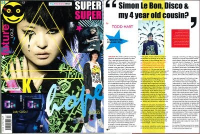
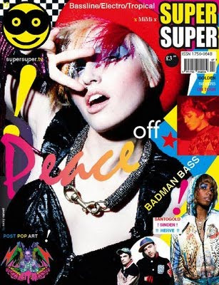

I used SuperSuper magazine as a reference for my flatplans as they are a music/fashion magazine that cover a lot of the same musicians my music would cover. I took a lot of influence fromt he way in which they do not stick to the traditional layout of a magazine. I plan to take this kind of haphazard approach with my magazine but I will be making it slightly more structured by sticking it to a theme of Clubkids who were a movement in New York in the late 80's/early 90's who pioneered the electro clash sound.
FRONT COVER PLAN
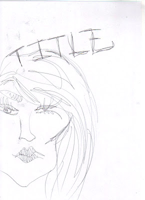 I want my front cover image to fill the whole page (as with many magazines). I want the image to be cropped into an extreme close up or to just be an extreme close up of the 'artist' who I will also feature in my interview. Instead of having writing all over my front cover I only want the title. At this stage I have not chosen a title. I want the colours of my front cover to be very bright and acidic: this will draw peoples eyes to it on a shelf and would also appeal to people who follow the scene my magazine refers to.
CONTENTS
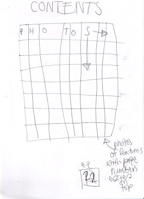
I'm not too keen on the traditional list style of contents page, so I tried to develop a different way which would still be easy to use. I have decided to place photos of the inside features on a grid and edit on page numbers over the image in a sort of advent calendar like fashion. I will display the images in numerical order to stop it from being confusing.
DOUBLE PAGE SPREAD
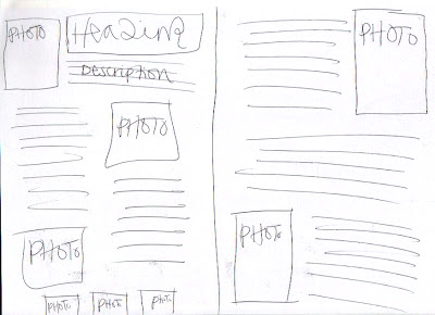
I want to use lots of imagery in my double page spread because I want to use as much of the photo shoot as I can to reiterate the idea of the glamour and fame of being a clubkid/musician. Also for this reason I want the heading (artist name) to be in huge letters. To keep a running theme the font used for the heading will also appear in the questions as a way to highlight the difference between Q + A .
